Please enable JavaScript to view this site.
Logo for imoptimal.com - small business website expert

Small business website accessibility (Towards better conversion rate)

I. Page structure & website navigation

1. Why is website accessibility complementary to speed optimization?

Like the website speed optimization, web accessibility is also crucial for improving your website's conversion rate and SEO ranking. That's because:

  • it increases the size of your potential audience (and the number of potential clients);
  • it improves the user experience for all of your website visitors (increasing the time they stay on a page, and the chance they'll convert).

Most of the website speed optimization steps I showed you before were "set it once and forget it". When it comes to website accessibility, it's rarely the case.

Most recommendations here you'll need to follow each time you're publishing a new post or creating a new (landing) page on your website. But once you get used to this approach, it's not so intimidating as the first time.

Let's start with the accessibility of your website's page structure.

2. Page structure

Each time you're creating a page, you'll need to structure it according to the content you're presenting. Prepare your page content beforehand, and pause to think what's the best way to showcase it. The main goal is to make it as easy as possible to understand, and for visitors to take the desired action.

2.1. Page title

Every page besides your homepage, starts with a title. In WordPress this title also determines that page's slug (part of the URL that's specific to that page). Page title has 2 important functions:

  • it helps visitors understand what the page is about;
  • it contributes to the SEO rankings of that page and your website overal.

2.2. Page sections

Next, you need to think about the formatting of content on a page. You should break the text on a page into meaningful sections. Each section should start with a distinct subtitle (H2 tag in comparison to the main page title that's H1 tag). Images also help to break the monotony of a longer text.

Here's an example of what to avoid when it comes to page structure: [Check the image below]

Image 1.1 (Small business website accessibility tutorial)

2.3. Color scheme

It goes without saying that every page on your website needs to use the same color scheme. Color consistency helps visitors to find/do what you intended for them to find/do.

The colors you use need to be aligned with your overall brand design. Most importantly - color contrast between the text and background(s) needs to be high enough - otherwise the text won't be visible to all website visitors.

Here's an example of low color contrast between the background and the text: [Check the image below]

Image 1.2 (Small business website accessibility tutorial)

For certain page elements (like links and buttons), color shouldn't be the only thing that makes them stand out. If the color contrast fails, links should be detectable as underlined parts of text. Similar with buttons - use a distinct and consistent shape.

This is an example of low color contrast and lack of underlines for links on a page: [Check the image below]

Image 1.3 (Small business website accessibility tutorial)

Don't worry - popular WordPress themes usually provide a set of accessible color schemes to choose from.

2.4. Additional considerations

There are few more things to consider here - and they're a bit technical. The first thing is keyboard accessibility of your page content.

If you're unfamiliar with the term - keyboard accessibility refers to a webpage being operable by someone using only a keyboard to access and control it. This includes users of screen readers, but can also include users who have trouble operating a pointing device such as a mouse or trackball, or whose mouse is not working at the moment, or who prefer to use a keyboard for input whenever possible.

Don't get freaked out - only the interactive elements on a page need to be accessible by keyboard. Unfortunately, if you want to test it manually, you'll need to do it on a computer. If you choose to do it - use the TAB key to go through the interactive page elements. You'll see the grey border around the currently focused element. In this example, you see thst grey border on selected input field. [Check the image below]

Image 1.4 (Small business website accessibility tutorial)

Fortunately, in case of WordPress, most themes from the official theme repository include those accessibility feature. I recommend using KadenceWP theme - it offers advanced building blocks for any small business website.

Another thing to have in mind is the language settings of your website. It's important to set the main website language - so that screen readers could work accordingly. In WordPress it's quite straightforward. In the admin dashboard, open the main menu (located in the header section, top left corner). Find the 'Settings' menu item and tap it to open the sub-menu items. Now tap the 'General' submenu item to open the settings page. [Check the image below]

Image 1.5 (Small business website accessibility tutorial)

On the 'General Settings' page, scroll down until you come to 'Site Language' option with the dropdown list. Here you can select the main language for your website. [Check the image below]

Image 1.6 (Small business website accessibility tutorial)

Have in mind that this setting will affect the admin dashboard language as well. Don't forget to scroll down and tap the 'Save Changes' button.

3. Website navigation

In comparison, when it comes to website navigation - it should be consistent throughout your website. You can change the menu items if needed on individual pages, but the design and it's functionality shouldn't change. That way you won't confuse people trying to navigate through your website.

Talking about drop-down menus - they should be accessible with a keyboard. Plus, the user should be able to go through the menu and close it using just a keyboard - they shouldn't encounter a dead end.

The navigation should be simple to use, so that visitors don't get confused or lost. Avoid adding too many links and other action items in the main menu. Everything that is of secondary importance should be put in the footer section of your website.

Here's an example of too many menu items - each with submenu items that open into a list of additional links: [Check the image below]

Image 1.7 (Small business website accessibility tutorial)

Lastly, you need to provide an option for people using keyboards to skip to content section of a webpage. WordPress themes from the official .org theme repository have this feature by default - it's a requirement.

If your theme doesn't provide this feature - there's one lightweight WordPress plugin that offers this and many other accessibility features. In the next step I'll show you how to easily set it up.

II. Text & media

Text

We already mentioned some text formatting best practices in the previous step. Besides the length of the text, and the color contrast - one of the main issues for your website visitors is the text size.

For the regular text on your website, I would recommend using at least the size of 16px. In case of small letters text don't go under 12px. On top of that, your website shouldn't disable the default web browser zoom feature - so visitors could zoom in when needed.

When it comes to the fonts you're using - they should be easy to read. Lately I've seen many examples of unreadable fonts that mimic handwriting. There's no point in choosing a pretty font that some (or most) visitors won't be able to read.

Here's such an example: [Check the image below]

Image 2.1 (Small business website accessibility tutorial)

Don't get me wrong - I love Amy Porterfield and her podcast, but how long did it take you to read this short punch line?

Next, the text alignment of your paragraphs should be either to the left or to the right. Data shows that people can have trouble reading centered text. That doesn't apply to titles and subtitles.

2. Media

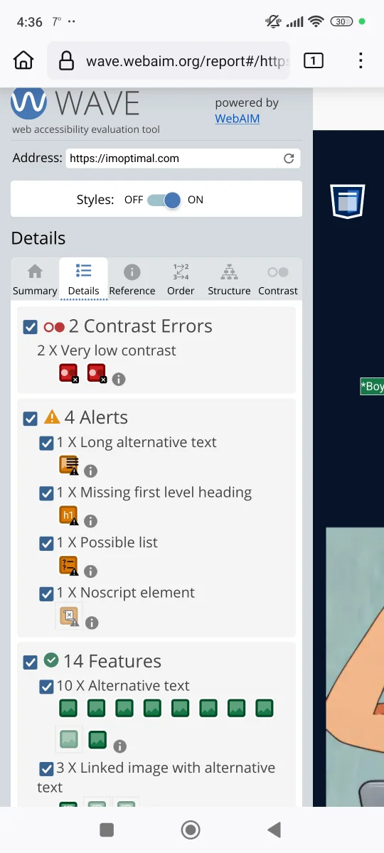
Images always help to break up the longer text, and they contribute to SEO rankings. Just make sure that each image has alt-text, in case images don't load properly (and for people using screen readers). Alt-text refers to textual description of the content visible in an image. It shouldn't be just stuffed with keywords, but genuinely helpful to you website's visitors.

It's acceptable to make an image for a short punch line, but avoid using images instead of whole paragraphs. It's can be confusing for people using screen readers, to understand images in place of text.

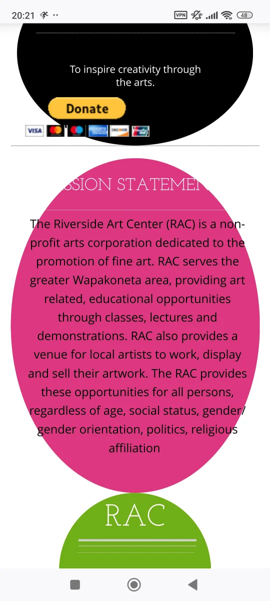
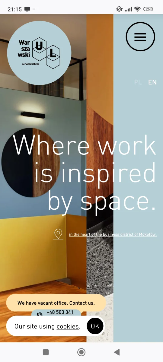
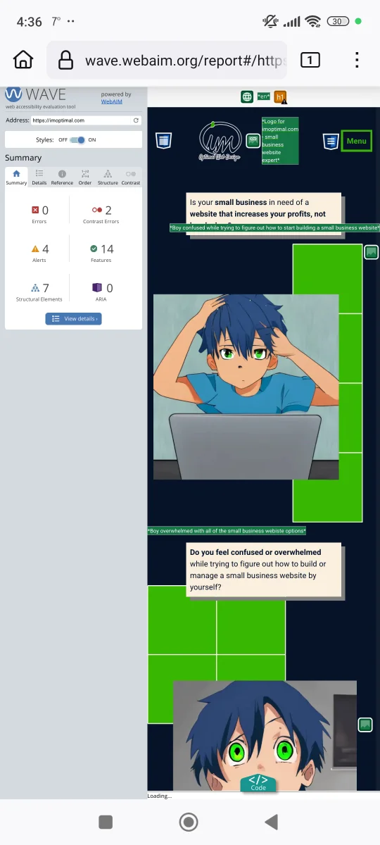
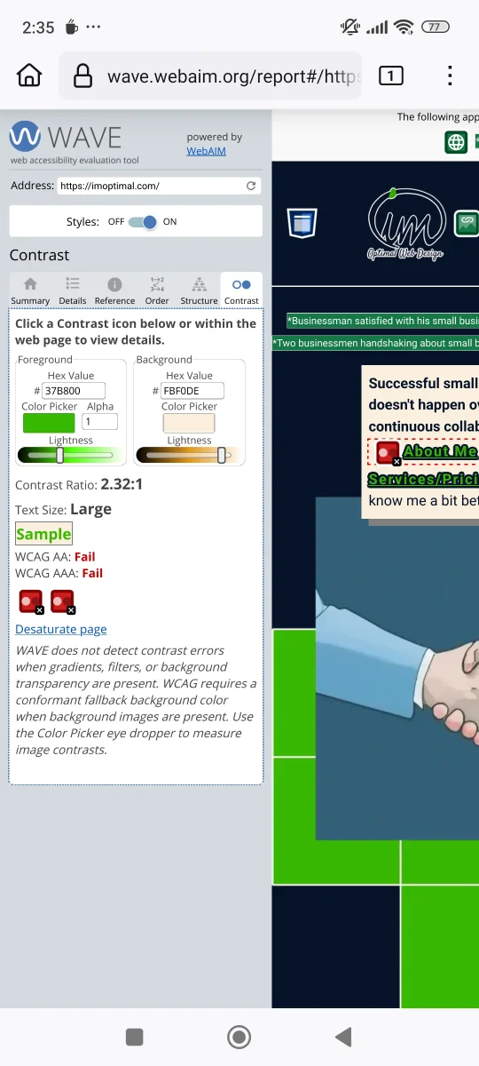
When using images as your page background - if there's any text positioned on top of it, it must be readable. Here's an example of text that's difficult to read because of the image background: [Check the image below]

Image 2.2 (Small business website accessibility tutorial)

There's two different ways to make text more readable:

  • those text elements should have a solid color background set (with high color contrast to the text);
  • if it's possible, set an overlay to that background image (with opacity set between 0.5 to 0.9).

We already talked about the performance and usability issues of image sliders - so don't use them.

If you're using video or audio content, don't use auto-play feature. Auto-play is not only annoying, but can confuse website visitors. Always provide an option for users to stop, pause or mute your content. Have in mind that people like to consume multimedia in a variety of ways.

For both audio and video content - take an additional effort to provide a written transcript. There are many online tools today that do it fast and free. Additionally, provide captions for videos. YouTube is always a good free option for your video content.

Be very careful when if you're considering using video as a background. Keep it really short and with slow motions - it shouldn't be too distracting. As with image backgrounds - make sure that any text on top of that background is readable.

3. How to improve website accessibility with a WordPress plugin

As I said before - popular WordPress themes provide many accessibility features out of the box. However, it can be tricky to make certain advanced website features (added with plugins) accessible. That's why I always recommend installing the 'One Click Accessibility' WordPress plugin.

In your admin dashboard. - head over to the main menu, and find the 'Plugins' menu item. Tap on it to reveal the sub-menu items. Now tap on the 'Add New Plugin' to go to the 'Add Plugins' page.

There you should type in the search input field the name of this plugin. Once it shows in your search results, tap the 'Install Now' button to install it. It will take few seconds for the installation to finish. You'll know it's finished, because the 'Install Now' button will be changed into 'Activate' button. Tap on it to active the plugin. [Check the image below]

Image 2.3 (Small business website accessibility tutorial)

You'll find the settings for this plugin in the main menu, under the 'Accessibility' menu item. When you tap on this menu item, 3 sub-menu items will be revealed:

  • Settings
  • Toolbar
  • Customize

[Check the image below]

Image 2.4 (Small business website accessibility tutorial)

'Settings' submenu item leads you to the 'General Settings' page of the plugin. Here you can enable or disable outline for the focused items, or add 'Skip to Content' link. Most things here you can leave as they are. I would just advise you to increase the amount of time user preferences are stored for. The default is 12 hours. I recommend changing that to 1 week. Don't forget to tap the 'Save Changes' button at the bottom of the settings page. [Check the image below]

Image 2.5 (Small business website accessibility tutorial)

'Toolbar' submenu item opens the 'Toolbar Settings' page. Here you can enable or disable individual features available through this plugin's toolbar. All features are enabled by default, and you should only disable those you don't need - if they are already provided by your WordPress theme and your overall website design.

The toolbar features enabled by default are:

  • font resizing
  • grayscale
  • high contrast
  • negative contrast
  • light background
  • underline links

You will need to manually link your website sitemap, help link and feedback link (if you have those pages). Don't forget to tap the 'Save Changes' button on the bottom of the settings page. [Check the image below]

Image 2.6 (Small business website accessibility tutorial)

Lastly, the 'Custonize' submenu item leads you to the website custmizer - where you can change the position of the toolbar icon, and it's appearance. [Check the image below]

Image 2.7 (Small business website accessibility tutorial)

One important thing you should change here is the 'Focus Outline Style'. The color of outline for the element in focus depends on your background color - it should be visible. Regardless, you should increase its width to 2-3px, and make it more noticeable. Tap the 'Publish' button to save changes (located in the header section, top right corner). [Check the image below]

Image 2.8 (Small business website accessibility tutorial)

If you're using a block theme, one important note here - ignore the notification at the top. Notification suggests that you should open site editor instead of the customizer. There are many other settings you can change in the site editor, but not these accessibility settings.

III. Additional accessibility tools

1. How to test website accessibility issues online

I know I showed you a fair amount of ways to improve the accessibility of your website - but you're still not sure what you need to do in your specific case?

I'll share some tools I use in my workflow, to help you get started. These tools help to:

  • test a website and find accessibility issues;
  • find attractive custom color palettes and test their accessibility.

The first step is to check your existing webpages for accessibility issues, to know what you need to change/improve. Although there are many online tools for this (including PageSpeed Insights), I recommend using WAVE Web Accessibility Evaluation Tools. This tool is the only one that points out all of the accessibility issues on the page itself.

Once you head over to the homepage of this tool - you need to paste the URL of the webpage you want to test. [Check the image below]

Image 3.1 (Small business website accessibility tutorial)

When you tap the arrow at the right side of the input field, you will land on the results page. There you'll notice a number of icons on top of the webpage you're testing. [Check the image below]

Image 3.2 (Small business website accessibility tutorial)

Unfortunately, the website is not mobile responsive - so you'll need use zoom in your mobile web browser. When you zoom the top left corner, you'll see all of the info this tool shows (divided into tabs).

The first (default) tab titled 'Summary' shows exactly that - the summary of the accessibility analysis of the webpage you're testing. This tab groups all of the info into 6 categories:

  • Errors (refers to a number of primary accessibility issues - like missing alt-text, empty button or link, etc.);
  • Contrast errors (refers exclusively to the issues with color contrast between the text and the background);
  • Alerts (refers to potential problems, not necessarily errors);
  • Features (lists all of the accessibility items marked as satisfactory);
  • Structural Elements (lists all of the HTML elements that make the structure of your webpage - header, footer, headings, etc.)
  • ARIA (refers to additional accessibility features - custom HTML attributes added to explain the role of a otherwise generic HTML element).

[Check the image below]

Image 3.3 (Small business website accessibility tutorial)

The 2nd tab titled 'Details' show all of the accessibility items found on the webpage, listed under their respective category. You can click the info icon for each item (in form of a grey circle with the letter 'i'), if you want a full explanation. [Check the image below]

Image 3.4 (Small business website accessibility tutorial)

If you click on the above mentioned info icon, the 3rd tab titled 'Reference' will be opened. This tab shows the full explanation for each type of accessibility feature, error or alert. [Check the image below]

Image 3.5 (Small business website accessibility tutorial)

The 4th tab titled 'Order' shows all of the items that you can navigate to using a keyboard, in order they appear on the page. This will show how many items one needs to TAB through before accessing the call to action item (the one you want them to reach as soon as possible). [Check the image below]

Image 3.6 (Small business website accessibility tutorial)

The 5th tab titled 'Structure' lists HTML elements that make the structure of your webpage (header, navigation, headings, footer, etc.). They're shown in order of appearance on the page. This list helps you evaluate how many subsection there are, and how relevant is the current page structure for the goal you want to achieve (to inform or lead visitors to a call to action). [Check the image below]

Image 3.7 (Small business website accessibility tutorial)

The last tab, titled 'Contrast' focuses on the color contrast between the text and background(s) on your webpage. Under the 2 input fields for foreground (text) and background color, you'll see the red icons. Those icons are signaling the color contrast errors on your webpage.

If you tap on one of the icons, it will highlight that error on the page, and give the contrast score. Colors used will be presented in the input fields - and you can tap on the 'Color Picker' to choose and test another color combination. [Check the image below]

Image 3.8 (Small business website accessibility tutorial)

Some of you might be wondering how to pick a different color combination, if the one you're using isn't accessible. I'll explain my process of choosing color schemes, and show you the tools I'm using - so you can do the same.

2. Getting inspiration for custom color combinations

The tool I'm using to get the inital inspiration is Pintrest. In the Pintrest search bar type the desired primary color, followed by 'color pallettes'. Here's an example with the orange color: [Check the image below]

Image 3.9 (Small business website accessibility tutorial)

After you find an interesting color combination, screenshot the image on your phone. The next step is to head over to this website - Color Picker online. Scroll down until you reach the 'Use your image' button. Tap on it to upload the screenshot you just made from Pintrest. [Check the image below]

Image 3.10 (Small business website accessibility tutorial)

This image will be displayed, and you're now able to get the color code from it. Tap on the part of the image where you see the color you want to sample. [Check the image below]

Image 3.11 (Small business website accessibility tutorial)

If you scroll down, you can see the color codes (in two versions). Tap the copy icon on the right side of the first color code (HEX). [Check the image below]

Image 3.12 (Small business website accessibility tutorial)

Now open the second tab on the website, titled 'Color Picker' (located in the header section). Scroll down until you reach the section titled 'Color Combinations'. Here you'll see different suggestions, for the color you previously picked from an image. Tapping on each of those color fields, you'll get that color HEX code. [Check the image below]

Image 3.13 (Small business website accessibility tutorial)

3. How to check if 2 custom colors have big enough color contrast

Lastly, when you choose 2 custom colors (one for the text color, another for the background color) - you need to make sure there's big enough color contrast. For this I suggest using WebAIM: Contrast Checker.

On this website, you'll see 2 sections - one for the foreground (text) color, another for the background color. The color codes you copied before, you need to paste into the 'Hex Value' input fields. Under those 2 sections, you'll see the contrast ratio score for colors chosen. The score is high enough if the score is highlighted with a green border. [Check the image below]

Image 3.14 (Small business website accessibility tutorial)

If you scroll down, you can see a more detailed score - for a text of normal size; for bigger text (or bolder); and for other user interface components (like input fields). [Check the image below]

Image 3.15 (Small business website accessibility tutorial)
X